
Diskify
Diskify
Diskify
Data Visualization Software
Data Visualization Software
Data Visualization Software
Overview
Overview
The Problem
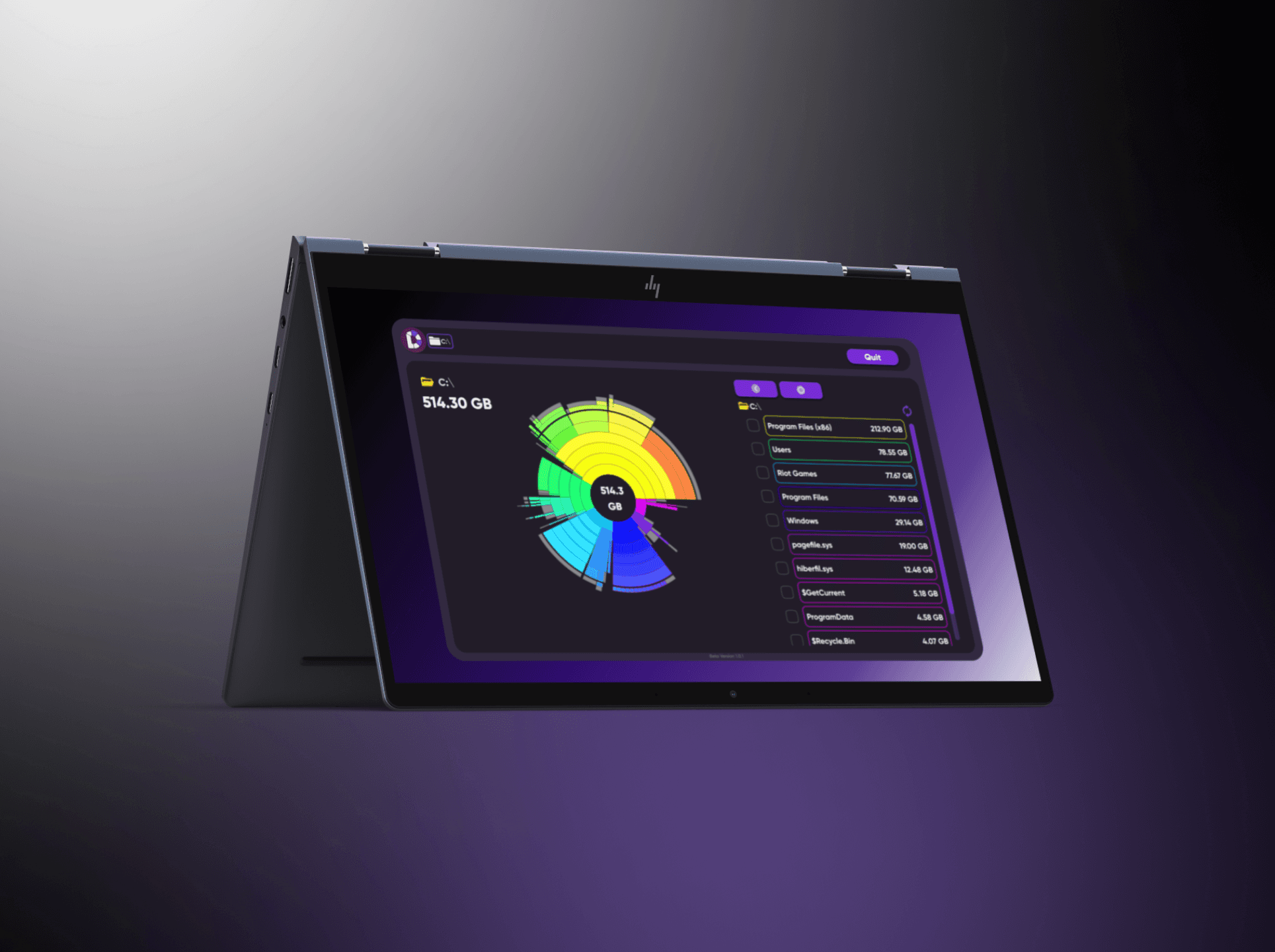
Most people have no idea what's actually eating their disk space. The native Windows experience — folders inside folders, cryptic filenames, no visual hierarchy — forces you to hunt linearly, one directory at a time. By the time you find what's causing the problem, you've wasted 20 minutes in File Explorer. Diskify started from a simpler question: what if you could see your entire drive at once?
The Problem
Most people have no idea what's actually eating their disk space. The native Windows experience — folders inside folders, cryptic filenames, no visual hierarchy — forces you to hunt linearly, one directory at a time. By the time you find what's causing the problem, you've wasted 20 minutes in File Explorer. Diskify started from a simpler question: what if you could see your entire drive at once?
My Role
UI Designer for Diskify's Windows beta, built by PRISM19. I owned the full app UI and the brand site — working directly with the founder through weekly design reviews, from first wireframes to final implementation. He built it. I designed it.
My Role
UI Designer for Diskify's Windows beta, built by PRISM19. I owned the full app UI and the brand site — working directly with the founder through weekly design reviews, from first wireframes to final implementation. He built it. I designed it.
Tech Stack

Figma
Design Tool

Framer
Web Tool

Spline
3D Design Tool
Tech Stack
Figma
Design Tool
Framer
Web Tool
Spline
3D Design Tool
Tech Stack
Figma
Design Tool
Framer
Web Tool
Spline
3D Design Tool
Created
Created
2024
Process
Process
Key Design Decisions
Staying in the sunburst on drill-down
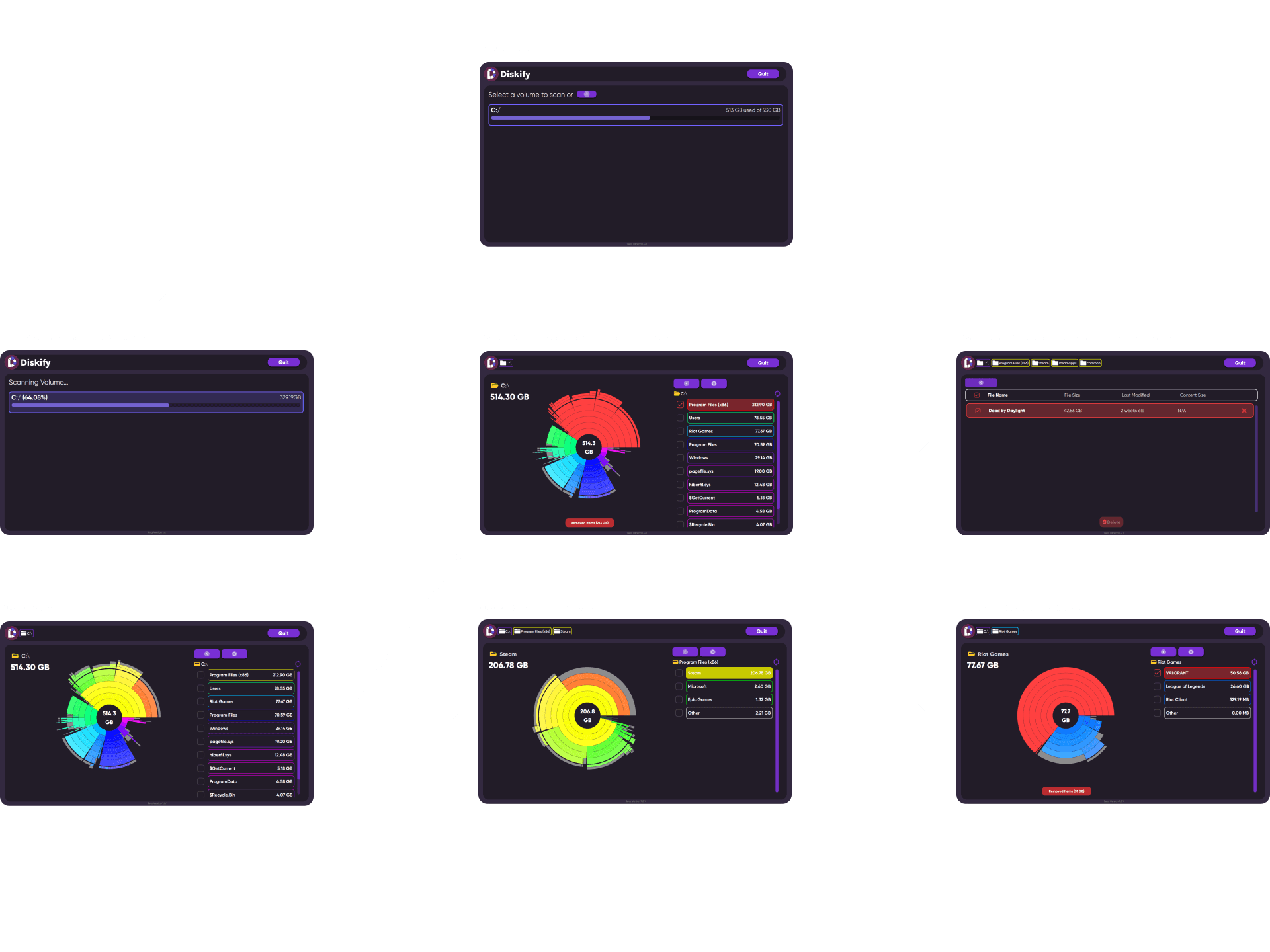
When a user clicks a segment, the chart zooms in and renders a new sunburst for that specific folder — rather than switching to a flat file list. You never context-switch from a visual map to a linear list. The hierarchy stays readable whether you're looking at your entire C:/ drive or a subfolder three levels deep. Breadcrumb navigation tracks your location without interrupting the flow.
Visualization + list as parallel views
The chart and the file list live on screen at the same time. The chart tells you what's big. The list tells you exactly what it is and lets you act on it. Neither alone tells the whole story — together they let a user go from "I see the problem" to "I know what to delete" without switching screens.
Wireframes
Wireframes focused on three core layout questions: how the sunburst chart and sidebar file list would coexist without competing for attention, where breadcrumb navigation would live to communicate hierarchy without cluttering the interface, and how the volume selection entry screen would set up the scan flow. Weekly check-ins with the founder meant wireframes evolved quickly based on what was technically feasible within the Windows desktop environment.
Key Design Decisions
Staying in the sunburst on drill-down
When a user clicks a segment, the chart zooms in and renders a new sunburst for that specific folder — rather than switching to a flat file list. You never context-switch from a visual map to a linear list. The hierarchy stays readable whether you're looking at your entire C:/ drive or a subfolder three levels deep. Breadcrumb navigation tracks your location without interrupting the flow.
Visualization + list as parallel views
The chart and the file list live on screen at the same time. The chart tells you what's big. The list tells you exactly what it is and lets you act on it. Neither alone tells the whole story — together they let a user go from "I see the problem" to "I know what to delete" without switching screens.
Wireframes
Wireframes focused on three core layout questions: how the sunburst chart and sidebar file list would coexist without competing for attention, where breadcrumb navigation would live to communicate hierarchy without cluttering the interface, and how the volume selection entry screen would set up the scan flow. Weekly check-ins with the founder meant wireframes evolved quickly based on what was technically feasible within the Windows desktop environment.

Volume selection as the entry point
Before any scanning happens, users choose which drive to scan — C:/, D:/, external drives — each showing a progress bar with used vs total storage. The idea was to let users orient at the highest level before diving into folder detail. You shouldn't have to scan your whole drive just to check one folder.
Dark theme with color-coded segments
A light background would wash out the color differences between storage segments — which is the main way users distinguish between folders at a glance. Dark backgrounds make the colored arcs pop. The target user is someone who cares about their system, not a casual user. The UI needed to feel like a tool, not a toy.
Brand Site
The site needed to feel like the app — same dark theme, same visual language, so anyone landing on it would know exactly what they were downloading. I built it in Framer with scroll-triggered animations. The 3D assets — hero shapes, footer decorations — were designed in Spline and integrated directly into the build. No stock assets.
"Your Files. Revisualized." — three words that say you're not just managing storage, you're seeing it differently.
Design to Handoff
Diskify was a traditional handoff — I designed in Figma, we reviewed weekly, the founder built to spec. That constraint made clarity of intent everything. I couldn't fix things in code after the fact, so every decision had to be deliberate and communicable on its own. It was a useful counterpoint to WheareAI where I controlled both sides — here, the design had to survive translation by someone else.

Conclusion
Conclusion
What Happened Next
Eight months ago the founder pivoted Diskify entirely — from disk visualization to LLM-powered file search. Different product, same core insight: people shouldn't have to organize their files. That idea carried straight into the new direction. The original sunburst product was the foundation that got them to the point where a pivot was possible.
What I'd Do Differently
Diskify taught me to design within constraints I don't control. If I had another cycle I'd push harder on two things: the loading and scan progress states — what does the app feel like during a long scan of a 1TB drive — and the empty states for nearly-empty drives. Those edge cases got less attention than the primary flow. I'd also instrument the deletion confirmation step early. Knowing how often users abandon there would tell me directly whether the friction was calibrated right or was accidentally blocking the core action.
